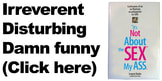
Upon a friend’s foolhardy request for my thoughts on his website, I observed that his use of reverse type — white type on a dark background — was hard to read. Reverse type cuts readership by almost half. He agreed to change it, adding that he’d used reverse type because he thought it would be “fun and artsy.”
No argument there. Reverse type is visually stunning. There are lots of other stunning things designers have been known to do with type as well: shape it, swirl it, turn it upside down, rotate it, mirror-image it and more. Just one problem. All of these shenanigans make the copy hard to read.
Readers don’t start out terribly interested in what you have to say. If you make it hard for them to find out, most won’t bother. So on the assumption that you have written good copy that is there for a reason, making it hard to read would seem counterproductive.
Do not fall for the oft-raised defense that doing unique things with type draws attention to it. Maybe it does. But if no one can read it, to what avail? Nor should you fall for the notion that hard-to-read type presents a challenge to which readers will rise. That is utter nonsense.
Put your copy where eyes expect to find it, and they will. If you want eyes to go to the next step — that is, actually read it — use black or very dark type on a white or very light background. Choose a high-legibility font with serifs, which is easier to read than sans serif type. While you’re at it, keep your paragraphs short.
Use of reverse and sans serif type is sometimes allowed for brief headlines and subheads. Otherwise, stick with these rules and you will increase readership. By the way, when you increase readership of your advertising, guess what happens to your sales.
—Steve Cuno
 RSS Feed